For some visitors to the museum, the most recognizable images of Whistler’s past are not photographs or objects, but logos and company branding. Just seeing Garibaldi Lifts Ltd.’s green and blue “G” can instantly remind a former lift operator of their company-issued jacket and the months they spent loading the Red Chair sometime between 1965 and 1980. Some logos and branding initiatives have lasted for decades while others were only in use for a few years and then forgotten, though traces of them can still be found around the Whistler valley long after they were first introduced.
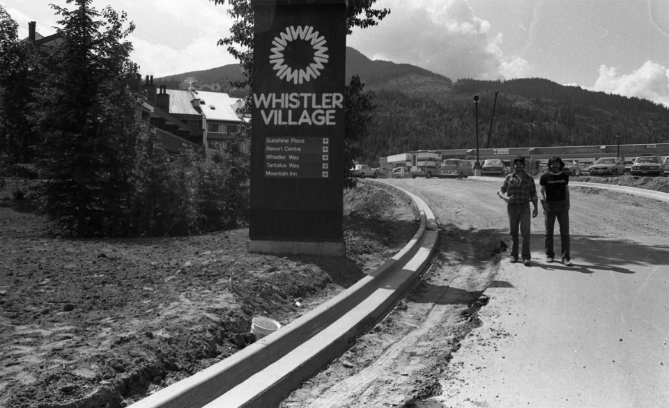
The Whistler Village Land Company (WVLC) introduced its “W” logo in their newsletter in December 1978. It was designed by Robert McIlhargey, an architectural illustrator who, with his wife Lori Brown, created much of the concept rendering work for Expo 86. McIlhargey was hired by the WVLC along with David Clifford as design consultants, helping plan elements of the Whistler Village like the logo and even directional signs. According to McIlhargey, the “W” logo and uniform branding and signage throughout the resort were meant to “reinforce the image of Whistler.”
The “W” logo consisted of a circle of Ws, often with the words Whistler Village written underneath. It was designed to be easily adapted to different settings through the use of different text and background colours (the logo was first introduced in green). Shortly after its introduction, the Ws were visible on signs at the entrance to the Whistler Village site and into the 1980s the Ws could be found on wooden signs, pamphlets, advertisements, and even turtlenecks. In 1979, Don Willoughby and Geoff Power of Willpower Enterprises were given permission to use the “W” logo to produce 1,000 T-shirts as souvenirs of the World Cup race that was meant to have run on Whistler Mountain.
Not all marketing and branding initiatives in Whistler have been as seemingly well received as WVLC’s “W” logo. The reception to the Big Old Softie initiative wasn’t exactly what the Whistler Mountain Ski Corporation (WMSC) had hoped for.
According to Whistler’s then-vice-president of marking Mike Hurst, Whistler Mountain began to be perceived as “the big ol’ tough ol’ mountain from way back” after Blackcomb Mountain opened for skiing in 1980, while Blackcomb built a reputation as a beginner-friendly mountain. Hurst described Blackcomb’s reputation as “this big, friendly family mountain, nice and soft, everything’s good.” Whistler Mountain did not yet have the same on-mountain amenities or family focused programs that Blackcomb did, but after 15 years without local competition Whistler Mountain was working to change its image.
Hurst and his team began trying to show that Whistler Mountain was “every bit as friendly and family oriented” as Blackcomb with lots of easy, beginner terrain. Working with Ron Woodall (the person behind the A&W Root Bear and the creative director of Expo 86), the Big Old Softie initiative was created. Featuring a rounded, smiling mountain, the Big Old Softie was not a universal hit. On rainy days, some changed the name to the “Big Old Soggy” and, according to Hurst, he and the Whistler Mountain team “got raked over the coals pretty good by pretty much everybody on the campaign.” Despite this, the Big Old Softie has proven memorable, and Hurst thought that it did bring attention to Whistler Mountain’s softer side and developing programs.
While you are unlikely to come across an image of the Big Old Softie walking through Whistler today, there are still circles of Ws and even some Garibaldi Lifts Gs that can be spotted around town.


